
The ampersand has been with us perhaps since the first century CE in one form or another. It’s a conjoining of the e and t, forming the Latin et, which means “and.” You can still make out both letters in even the most abstract designs since typographers know that the ampersand is a ligature and design it as such. Because ampersands are so highly stylized, they can add verve to a workhorse typeface.
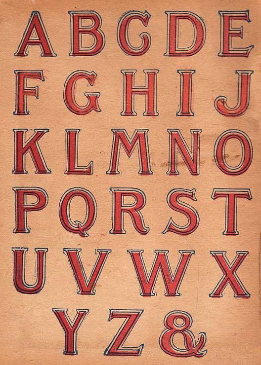
Pre-Victorian alphabets included the ampersand as the 27th letter.
Designers, take note: as Robert Bringhurst has written, the italic versions of ampersands are less restrained than their roman counterparts. “Since the ampersand is more often used in display work than in ordinary text…there is rarely any reason not to borrow the italic ampersand for use with roman text.” An italic ampersand can bring panache, and a completed appearance, to even the stodgiest logo—like a colorful necktie.
Etymology: Pre-Victorian grammar schools included the ampersand as the last letter of the alphabet. Children ended recitations of the alphabet with “x, y, z and, per se, and” which through rote repetition became the garbled “ampersand.”
The ampersand is still used as a letter in “&c,” a widely-accepted abbreviation of et cetera.