From the documentary “Helvetica,” by Gary Hustwit, ©2007 Swiss Dots Ltd.
Until the late mid 1980s, ‘font’ was a word that one never heard outside of the printing trades. When desktop computing made multiple typefaces available to the general public, ‘font’ entered the vernacular. It now refers to both the typeface—the design and appearance—and to the software file that generates it.
Traditionally, a font was a set of foundry type in a single point size (e.g., Helvetica is a typeface, and 48 point Helvetica Bold is a font). Few now make the distinction. Stephen Coles wrote, “When you talk about how much you like a tune, you don’t say: ‘That’s a great MP3,’ you say, ‘That’s a great song.’ The MP3 is the delivery mechanism, not the creative work, just as in type a font is the delivery mechanism and a typeface is the creative work.”
“Font” versus “Typeface”:
Typeface: “I love the Goudy Old Style.”
Font: “I’m going to install Caslon.”
Etymology:
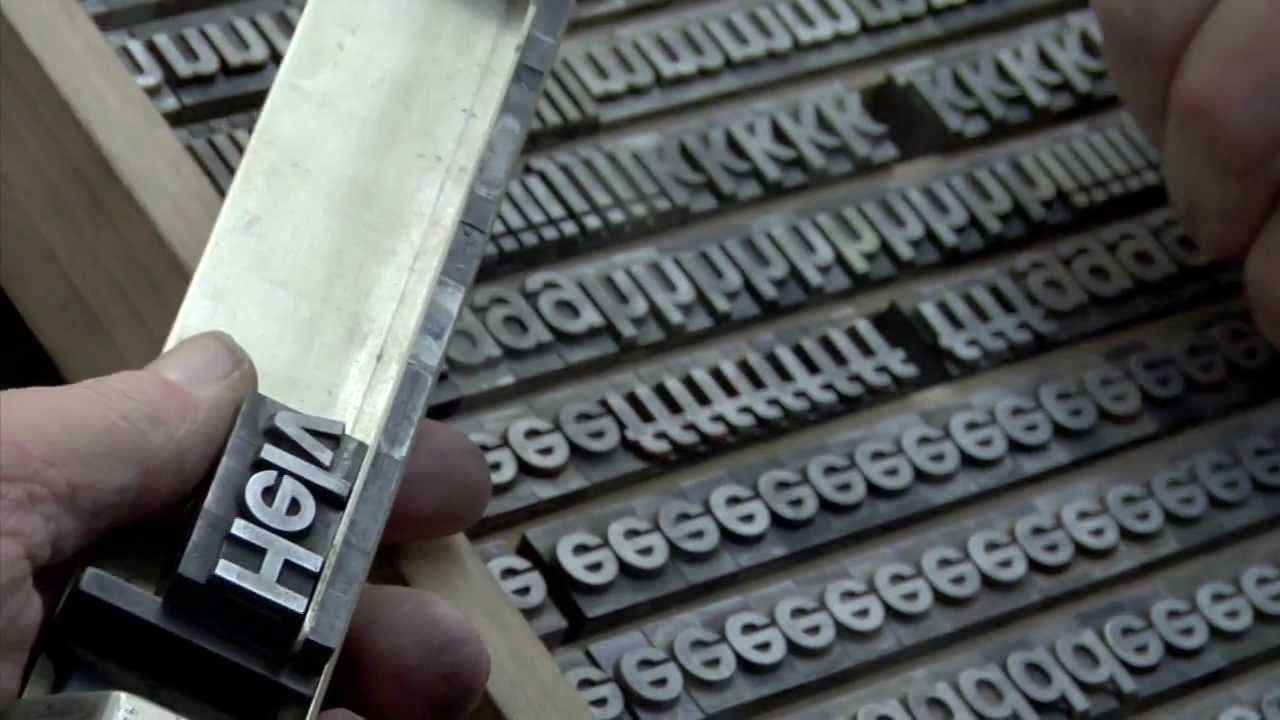
The English use of font as “a casting of metal type” dates back to the late 17th century. It derives from the French fonte “a casting,” from fondre to “melt” or to “cast.” This makes “font” a cognate of “foundry,” from the French fonderei, the industrial site where metal type was designed and cast. Digital type is still created and distributed by ‘foundries,’ though they may simply be an office in Buenos Aires, Argentina (Sudtipos), or Bandung, Indonesia (Decade Type Foundry), or Ireland (Paulo Goode).
‘Font’ addressed on Merriam-Webster podcast:
Emily Brewster and her colleagues discuss the current usage of ‘font’ on the Word Matters podcast.