Confession: we once used a chop suey typeface

Back in 2000, the owner of a popular Vietnamese restaurant in San Diego that we frequented asked us to create a customized open/closed sign for his entrance. He was a droll young fellow, so we came up with an absurdly conventional old-chestnut-of-a-design using a chop suey typeface and presented a proof to him in jest. Hot Chef (as he was called by admirers) loved it, and to our surprise, we produced it for him.
Chop Suey typefaces

“Ethnic” typefaces do have a place in graphic design, though you’re well advised to avoid them, unless your client insists. After all, who would give the carry-out box in the illustration a second thought if Moishe had used the typeface Shalom? Even so, sensitivity is recommended. read more…
Bifur: A.M. Cassandre’s great Art Deco typeface
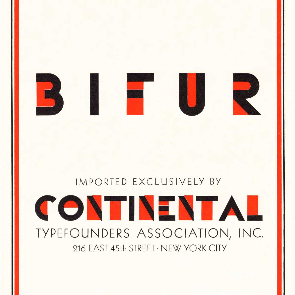
We picked up a copy of Continental Type’s 1930 type specimen book, a lovely two-color catalog of metal type exclusively available from foundries in England, France, Spain, Germany, Holland and Italy. It features the great poster artist, Adolphe Mouron Cassande’s bold, iconic 1929 Art Deco typeface read more…
Ed Benguiat (October 1927– October 2020)
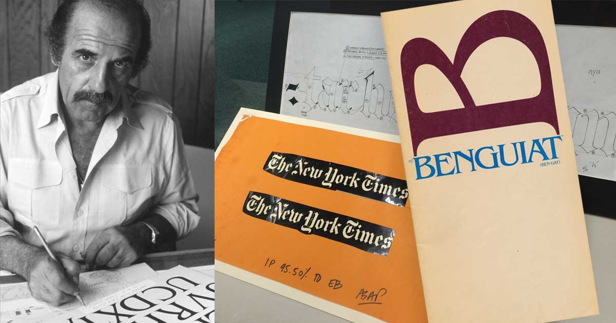
Ed Benguiat may be best known to the general public for his eponymous typeface, but he designed many typefaces. While working for Photo-Lettering, Inc (known as PLINC), and for ITC (International Typeface Corporation) Benguiat designed Barcelona, Bookman, Caslon No. 224, ITC Century Handtooled, ITC Edwardian Script, Souvenir, Tiffany and other popular faces. He was a teacher and a mentor. He inspired a collection of typefaces by House Industries. read more…
Benjamin Franklin’s waggish defense of John Baskerville’s type
In 1760, the American printer, Benjamin Franklin wrote to John Baskerville and paid him a visit.
Baskerville’s reputation, and even his eponymous typeface, had been maligned by “gentlemen” who may have been jealous of Baskerville’s talent, nonconformism, and increasing success. Baskerville used excerpts from one of Franklin’s letters as an “unsolicited testimonial“ in advertisements, but typographers will appreciate how clever Franklin was in his support of Baskerville: read more…
Lasting ephemera: Samuel Johnson’s “The Rambler”
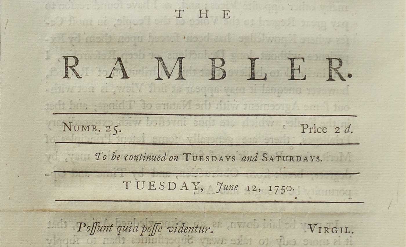
The Rambler was a twopenny* sheet issued twice weekly in London between 1750 and 1752, each issue was a single anonymous essay. 208 periodical essays appeared, all but four written by Samuel Johnson. Dr. Johnson’s incentive was to pay the bills (“No man but a blockhead ever wrote except for money”) while he was at work on his great Dictionary. read more…
Ampersands, &c.

The ampersand has been with us perhaps since the first century CE in one form or another. It’s a conjoining of the e and t, forming the Latin et, which means “and.” You can still make out both letters in even the most abstract designs since typographers know that the ampersand is a ligature and design it as such. Because ampersands are so highly stylized, they can add verve to a workhorse typeface. read more…
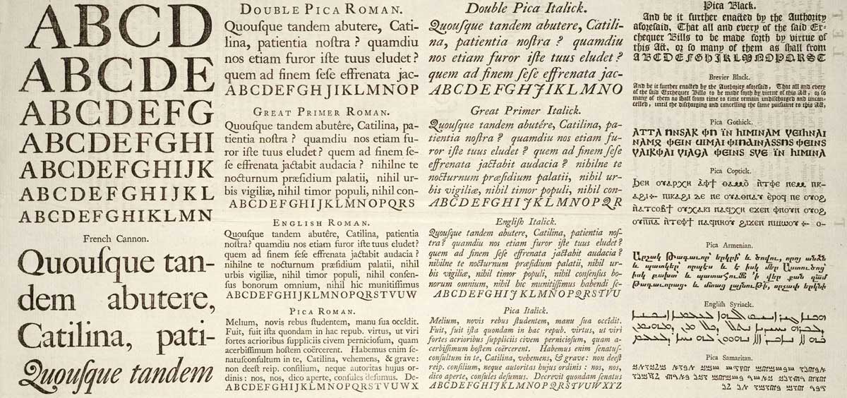
American Type Founders Specimen Book…
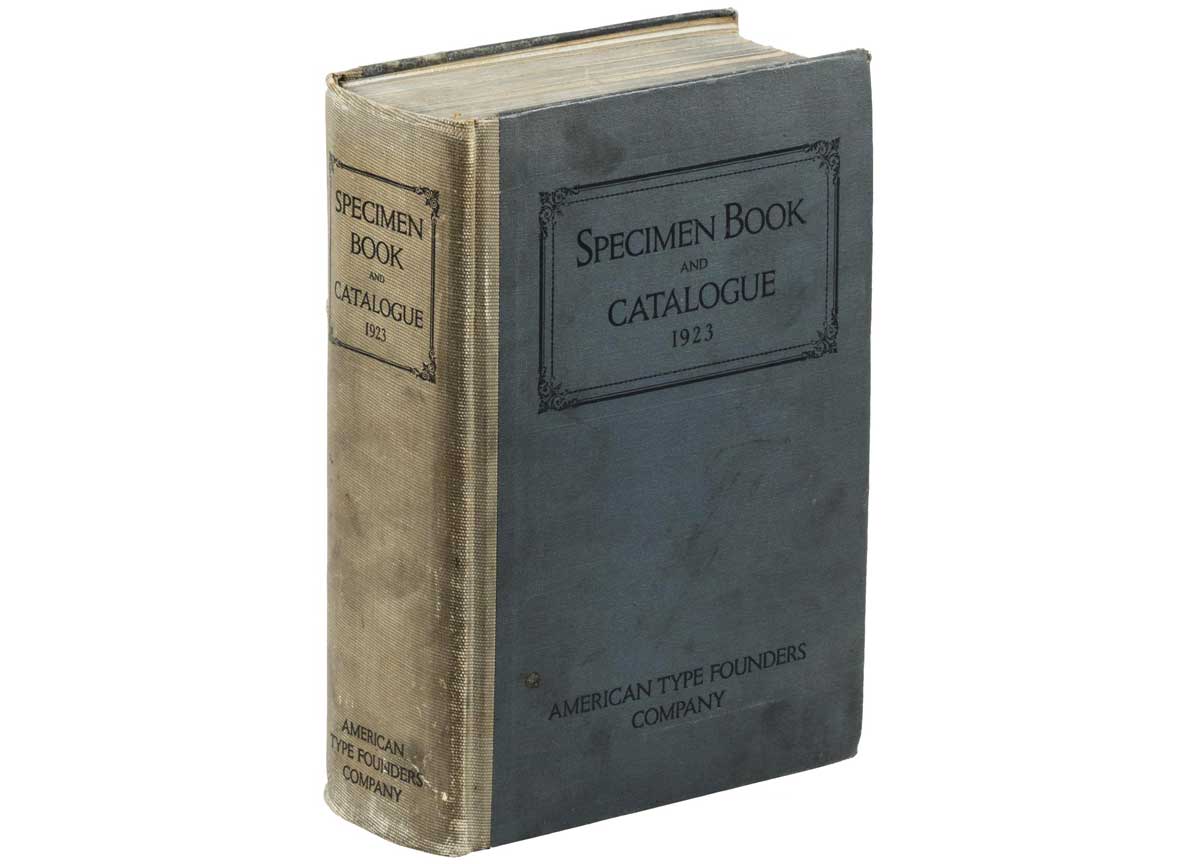
American Type Founders was born of a merger of 23 type foundries in 1892. In the early 1920s, American Type Founders had come to dominate the huge metal foundry type market in the United States. They budgeted a whopping $300,000 (millions in today’s dollars) to produce 60,00 copies of their 1923 Specimen Book. read more…
Georgia: old style text figures
 Old style figures blend invisibly into text.
Old style text figures (or lower case, non-lining numerals) have become popular in graphic design in recent years. read more…
Italic ampersands liven up logos
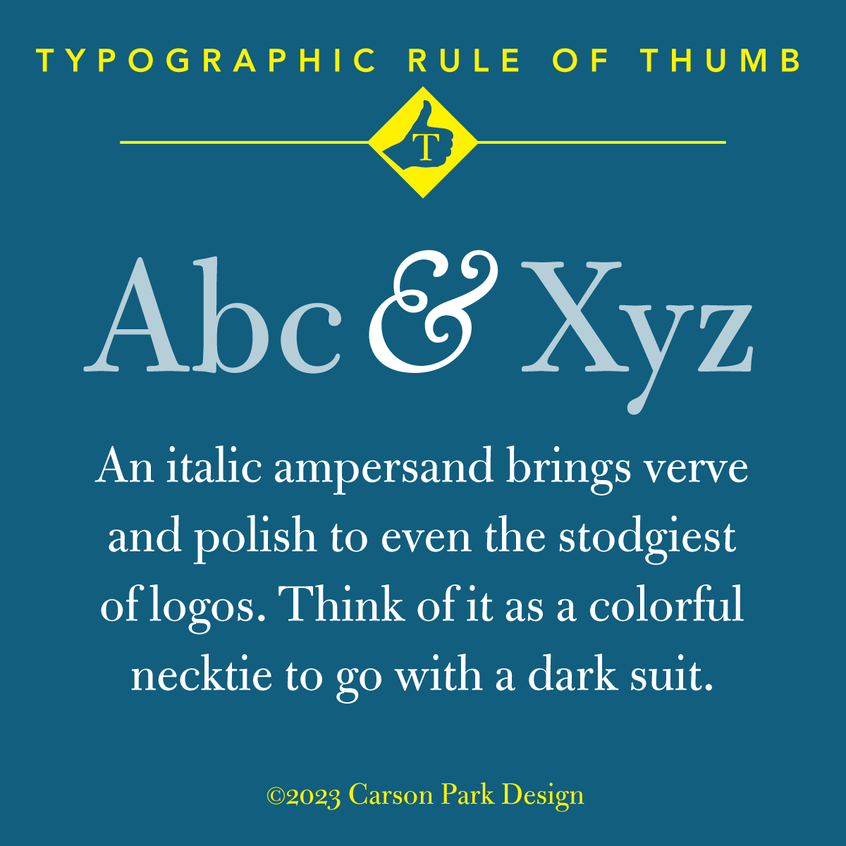
Bulmer MT Regular with a Goudy Oldstyle Italic ampersand
The italic versions of ampersands are typically less restrained than their roman counterparts. read more…