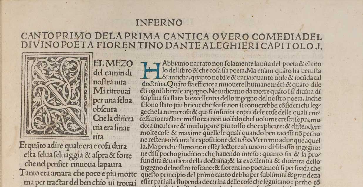
Here’s an illustration of how early printers marked the space for hand-lettered versals (‘drop caps,’ or enlarged initial letters). The John Rylands Library in Manchester, England, has a few copies of Dante’s Commedia, printed in Venice by Octavianus Scotus in 1484. We can compare a printed-only copy of Dante’s work with another copy from the same print run that was rubricated (decorated by hand). Notice the lower case ‘h’ printed in the three-line square space at the beginning of the first chapter:
The second copy (below) has been illuminated by a calligrapher who hand lettered the ‘H’ with a blue Lombardic capital. The printed ‘h’ made hand rubrication faster and easier for the letterer and eliminated possible spelling errors. This is a useful illustration of how early printers used a combination of print and hand-lettering for initial caps and other rubrication.
This book was one of the earliest to be printed not in Latin, but in a vernacular language (which was probably not yet called ‘Italian’).