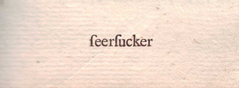
The long s (∫) has its roots in Roman cursive and was common in print in Europe from the 15th through the 18th centuries. It still appears in the German Eszett (ß), which is an sz ligature (a connected long s and short z). Language writer, Ben Zimmer, was once looking for the earliest references to the fabric seersucker and he discovered that his searches were hobbled by the problem of optical character recognition (OCR) programs mistaking the long s for an ‘f’ in old texts. He searched instead for ‘feerfucker’ and discovered late 17th century references that predated the earliest citations in the Oxford English Dictionary. More on seersucker here. Although usage varied a bit from one language to the next, there were rules on where the ‘∫’ was placed in text.
The 18th century English printer John Bell phased out the use of the long s around the time his popular eponymous serif typeface was introduced (designed and cut in 1788 by Richard Austin), and by 1810 the new practice had been universally embraced. The long s continued in handwriting for another half century.