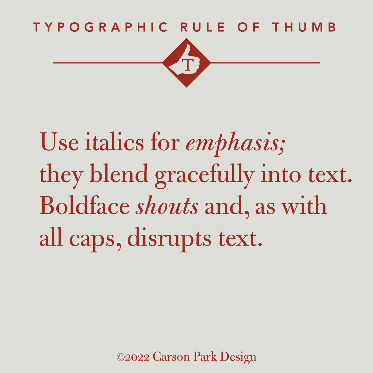
Italics are the elegant way to emphasize text. Bold faces are for headlines, posters or logos. Bold type breaks up the flow and degrades the readability of text just as words or phrases in all caps are like blotches in a column of type. Type often comes in extended families of varying weights, but as Robert Bringhurst said of boldface (which did not exist until the nineteenth century), “The marriage of type and text requires courtesy to the in-laws, but it does not mean that all of them ought to move in, nor even that all must come to visit.”
And cool it on the exclamations.