
“Ethnic” typefaces do have a place in graphic design, though you’re well advised to avoid them, unless your client insists. After all, who would give the carry-out box in the illustration a second thought if Moishe had used the typeface Shalom? Even so, sensitivity is recommended.
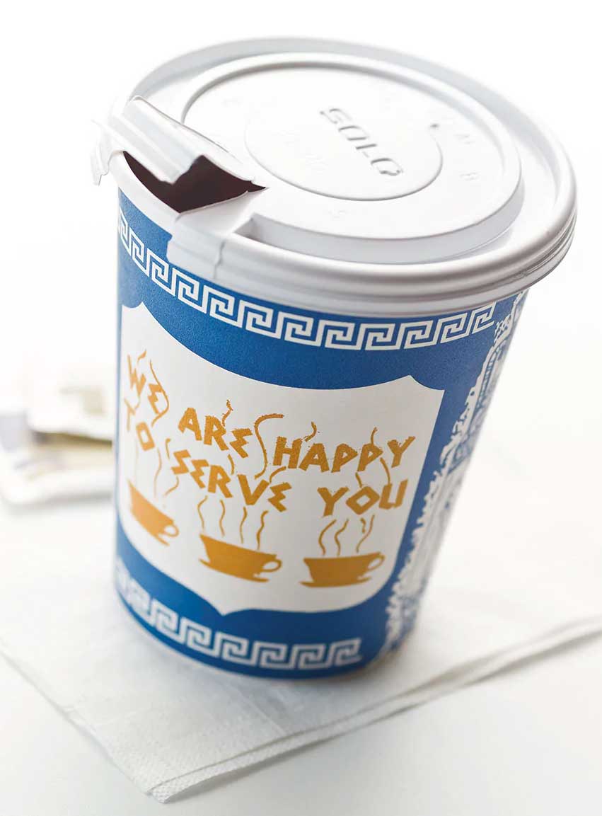 For some reason, ethnic typefaces are only common in the restaurant and bar industries. The most recognizable and ubiquitous of “ethnic fonts” are the faux Asians, or chop suey typefaces: Kanban, Wonton, Rickshaw, &c. Paul Shaw, in Print Magazine claims that the mother of all chop suey faces is Mandarin, originally known as Chinese, designed by Henry H. Thorp for Cleveland Type Foundry, and released in 1883. Type designers later moved on to create cliché representations of Irish, Greek, Arab, Tropical Hispanic, Slavic, German and French. No linguistic or cultural group was safe from typographic caricature: hippies, trekkies, scrapbookers, programmer/geeks, new-agers, believers in unicorns, headbangers, fratboys, needlepointers, grafifiti artists, restroom taggers, renaissance fairgoers, secret agents, Klingons and cowboys.
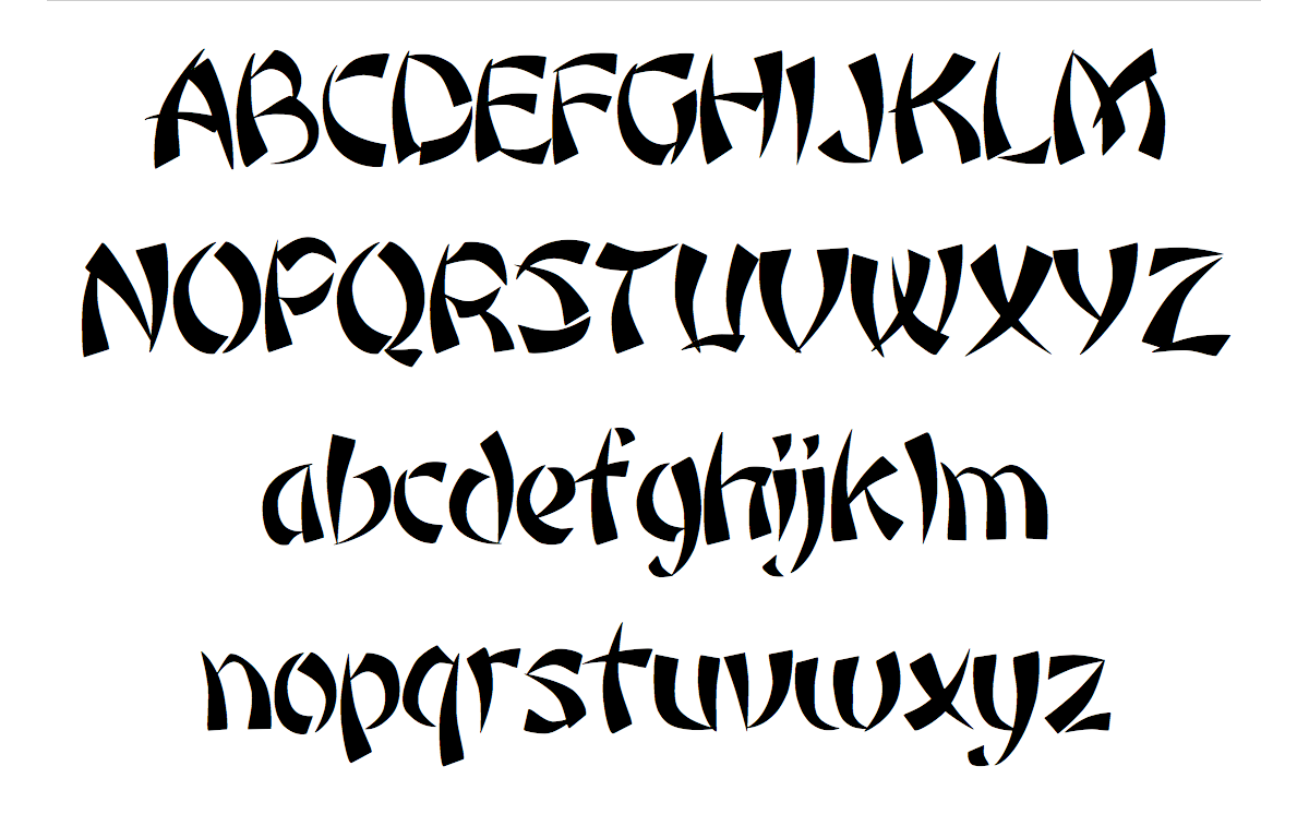
Rickshaw, an Image Club typeface
And since we all use the Roman alphabet, it would be redundant to stereotype ancient Latin, right? Guess again.
Linus Boman’s fascinating video on chop suey type is worth watching.