Bifur: A.M. Cassandre’s great Art Deco typeface
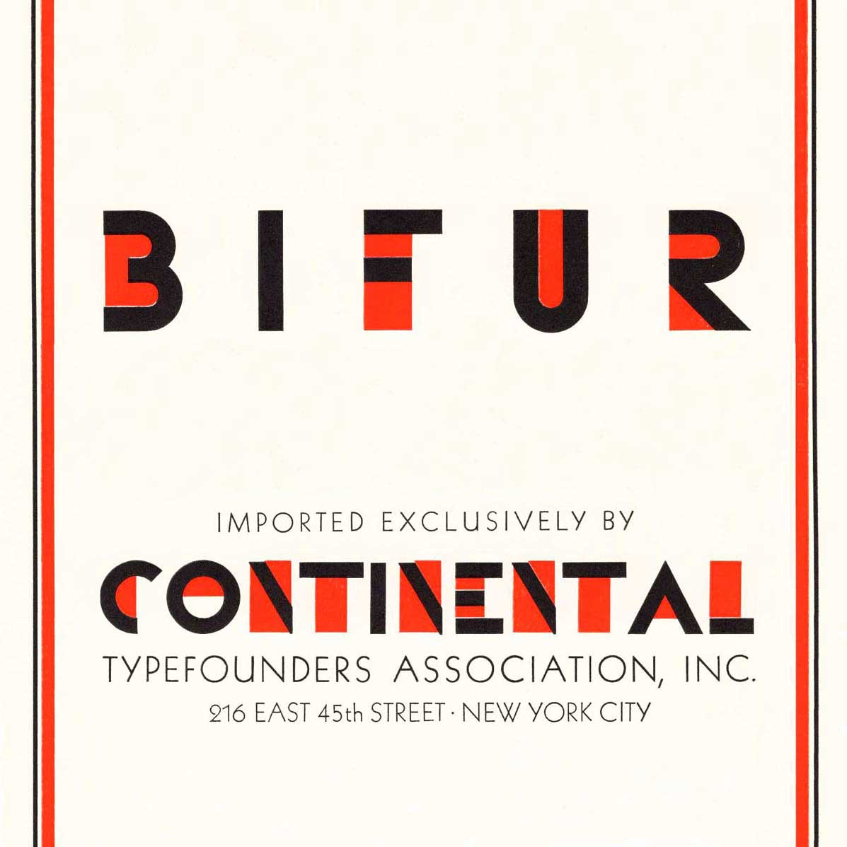
We picked up a copy of Continental Type’s 1930 type specimen book, a lovely two-color catalog of metal type exclusively available from foundries in England, France, Spain, Germany, Holland and Italy. It features the great poster artist, Adolphe Mouron Cassande’s bold, iconic 1929 Art Deco typeface read more…
Ed Benguiat (October 1927– October 2020)
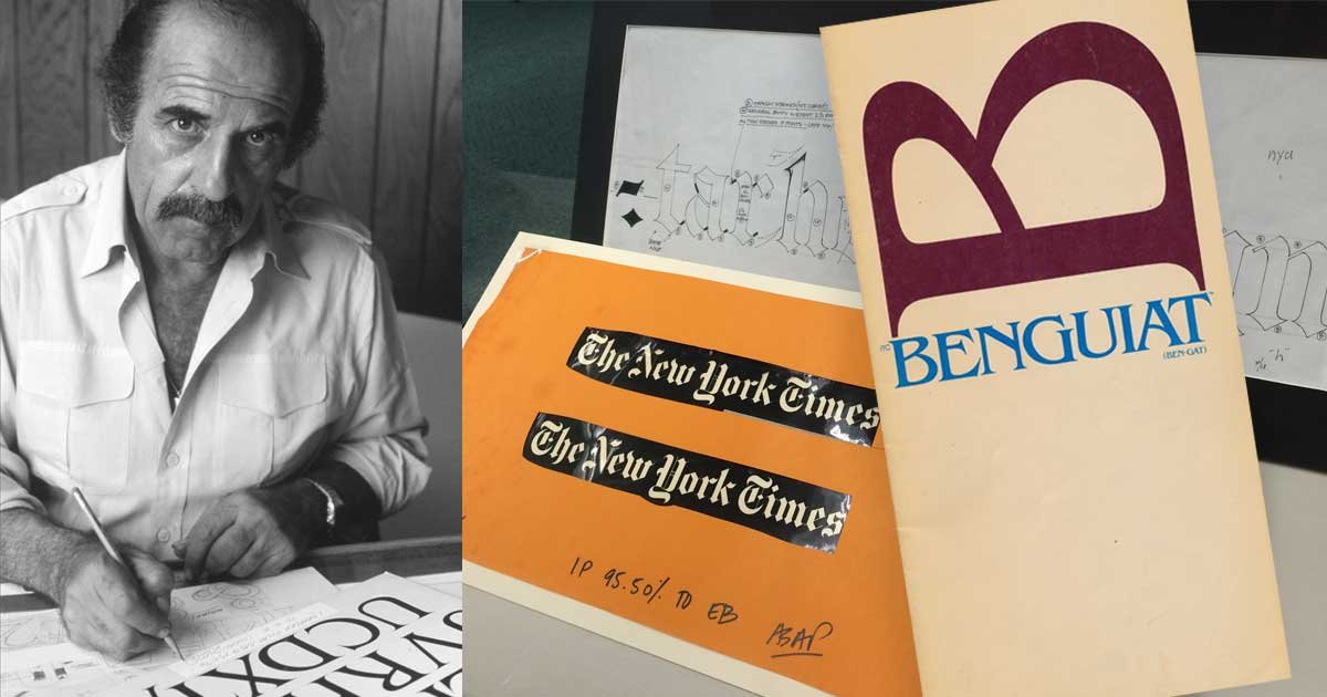
Ed Benguiat may be best known to the general public for his eponymous typeface, but he designed many typefaces. While working for Photo-Lettering, Inc (known as PLINC), and for ITC (International Typeface Corporation) Benguiat designed Barcelona, Bookman, Caslon No. 224, ITC Century Handtooled, ITC Edwardian Script, Souvenir, Tiffany and other popular faces. He was a teacher and a mentor. He inspired a collection of typefaces by House Industries. read more…
Hyphens, en dashes, and em dashes
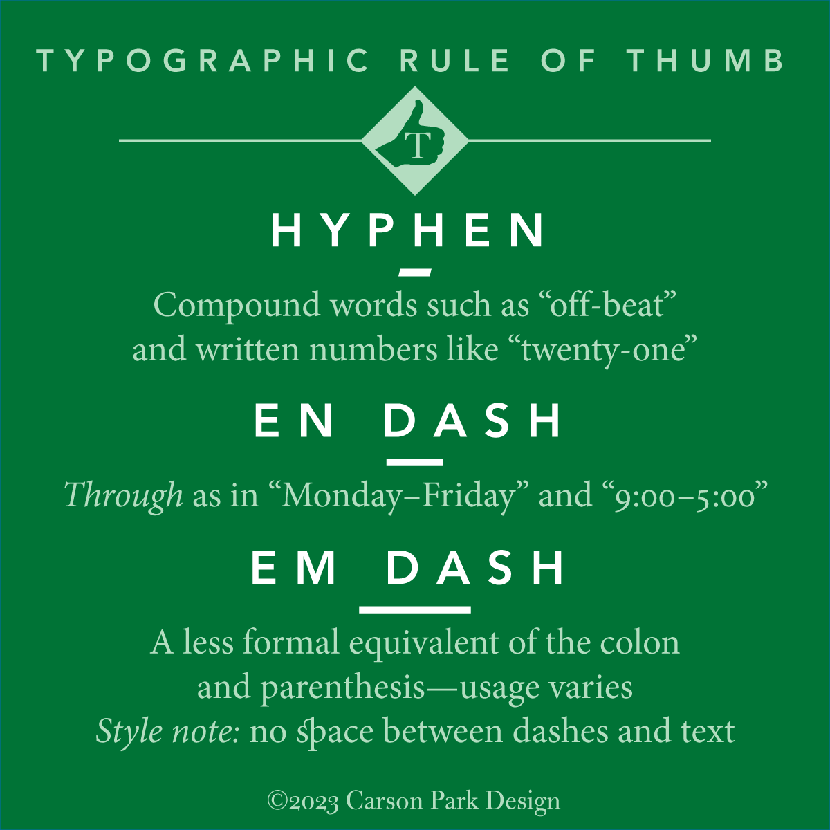
For decades now, typographic sorts that were unavailable on typewriters have been available to everyone on digital devices. We’ve always had hyphens, but now we can also use dashes. read more…
Benjamin Franklin’s waggish defense of John Baskerville’s type
In 1760, the American printer, Benjamin Franklin wrote to John Baskerville and paid him a visit.
Baskerville’s reputation, and even his eponymous typeface, had been maligned by “gentlemen” who may have been jealous of Baskerville’s talent, nonconformism, and increasing success. Baskerville used excerpts from one of Franklin’s letters as an “unsolicited testimonial“ in advertisements, but typographers will appreciate how clever Franklin was in his support of Baskerville: read more…
Lasting ephemera: Samuel Johnson’s “The Rambler”
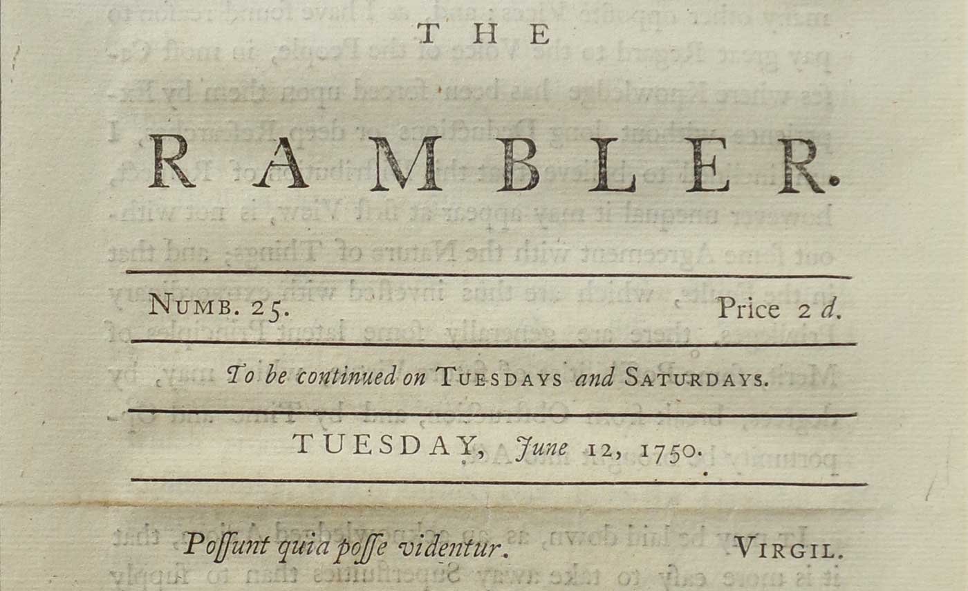
The Rambler was a twopenny* sheet issued twice weekly in London between 1750 and 1752, each issue was a single anonymous essay. 208 periodical essays appeared, all but four written by Samuel Johnson. Dr. Johnson’s incentive was to pay the bills (“No man but a blockhead ever wrote except for money”) while he was at work on his great Dictionary. read more…
Ampersands, &c.

The ampersand has been with us perhaps since the first century CE in one form or another. It’s a conjoining of the e and t, forming the Latin et, which means “and.” You can still make out both letters in even the most abstract designs since typographers know that the ampersand is a ligature and design it as such. Because ampersands are so highly stylized, they can add verve to a workhorse typeface. read more…
Beware: “web hosting” billing scams
It looks like an annual web hosting bill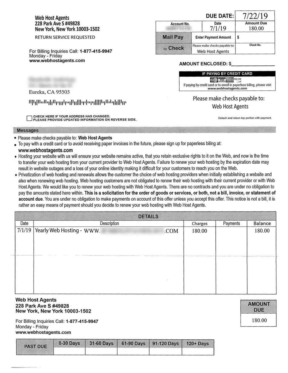
A company called Web Host Agents sends businesses what appears to be an invoice for “yearly web hosting.” At a glance, it does look like an invoice, but buried within the text you’ll see “This is a solicitation…not a bill.” One can imagine a busy accounts payable office simply sending a check. read more…
Email signatures: best practices
Guidelines for email signatures:
- Text only is predictable and consistent
- Avoid logos, social media image-links, photographs, etc
- Avoid HTML formatting—some recipients may only see text
- Quotations are not necessary and may look unprofessional
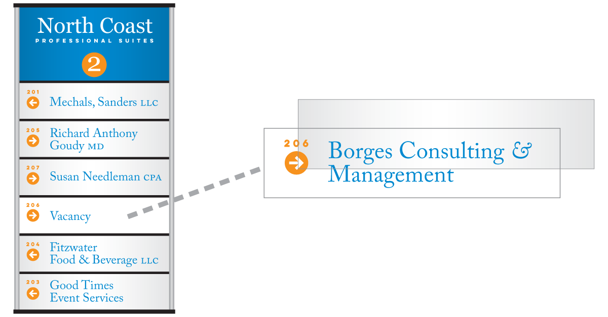
Changeable two-sided cantilevered directional signs
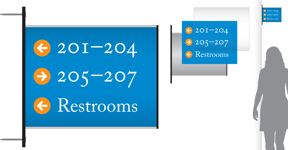
Along with smart-looking lobby directories, we now offer two-sided directionals that can be easily changed/updated with prints from your office copier. read more…
Changeable wall-mounted directories
We now offer inexpensive directories and directionals that can be easily changed/updated with prints from your office copier. read more…