Ampersands, &c.

The ampersand has been with us perhaps since the first century CE in one form or another. It’s a conjoining of the e and t, forming the Latin et, which means “and.” You can still make out both letters in even the most abstract designs since typographers know that the ampersand is a ligature and design it as such. Because ampersands are so highly stylized, they can add verve to a workhorse typeface. read more…
Beware: “web hosting” billing scams
It looks like an annual web hosting bill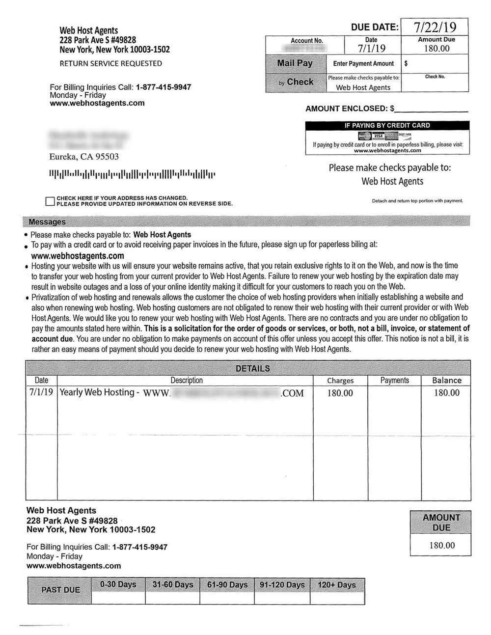
A company called Web Host Agents sends businesses what appears to be an invoice for “yearly web hosting.” At a glance, it does look like an invoice, but buried within the text you’ll see “This is a solicitation…not a bill.” One can imagine a busy accounts payable office simply sending a check. read more…
Changeable two-sided cantilevered directional signs
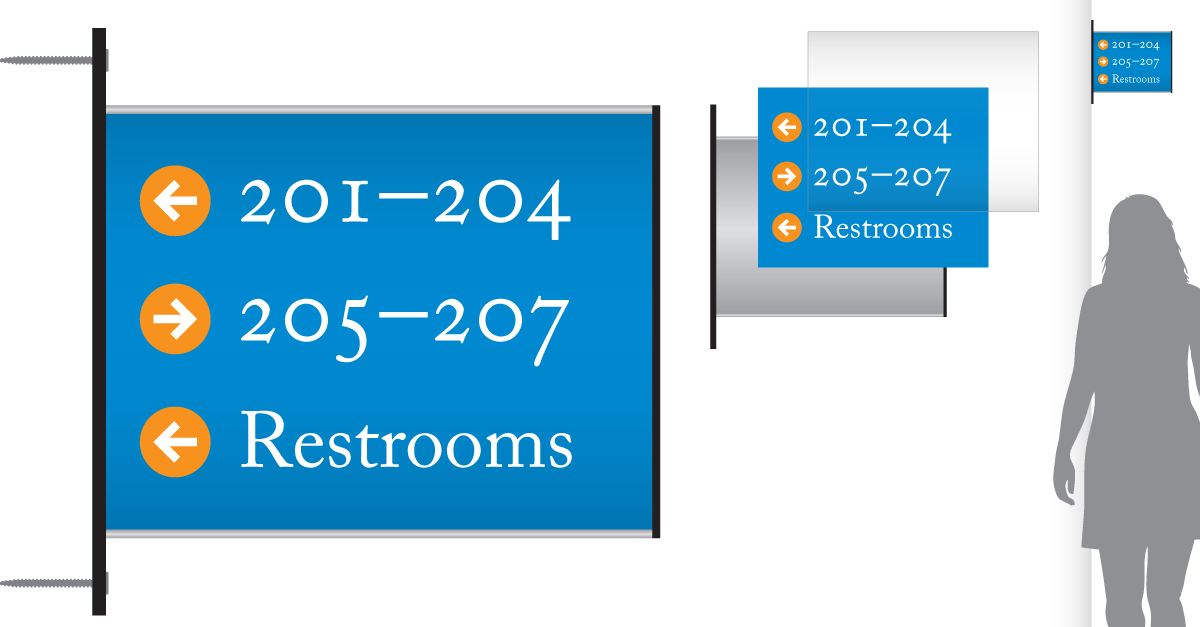
Along with smart-looking lobby directories, we now offer two-sided directionals that can be easily changed/updated with prints from your office copier. read more…
Changeable wall-mounted directories
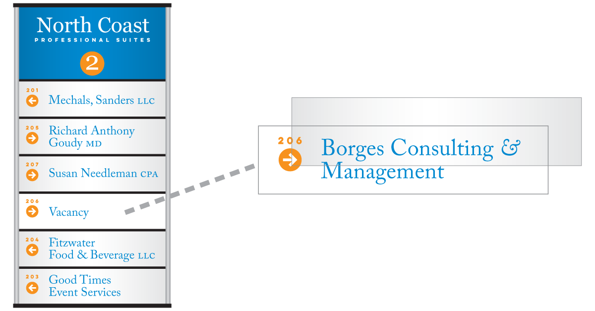
We now offer inexpensive directories and directionals that can be easily changed/updated with prints from your office copier. read more…
American Type Founders Specimen Book…
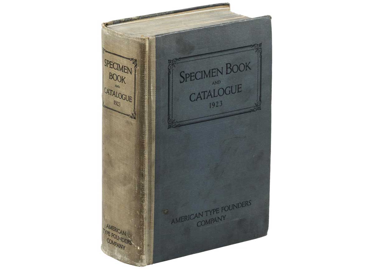
American Type Founders was born of a merger of 23 type foundries in 1892. In the early 1920s, American Type Founders had come to dominate the huge metal foundry type market in the United States. They budgeted a whopping $300,000 (millions in today’s dollars) to produce 60,00 copies of their 1923 Specimen Book. read more…
Georgia: old style text figures
 Old style figures blend invisibly into text.
Old style text figures (or lower case, non-lining numerals) have become popular in graphic design in recent years. read more…
Google Ads versus Facebook advertising
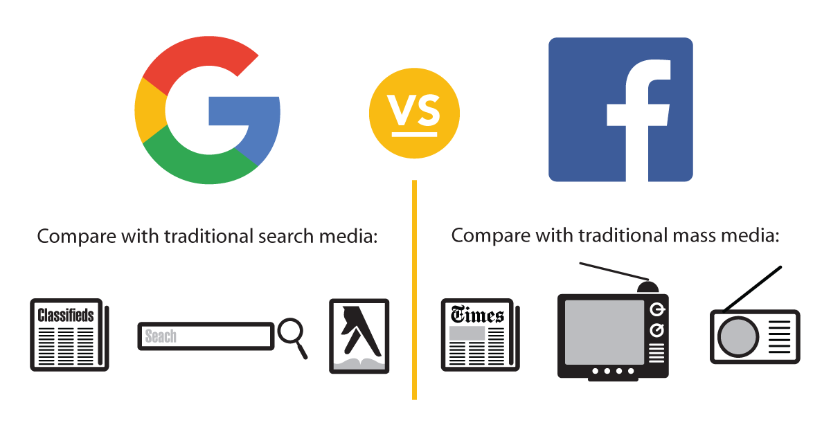
A thumbnail understanding of Google Ads and Facebook ads and promoted posts: read more…
Italic ampersands liven up logos
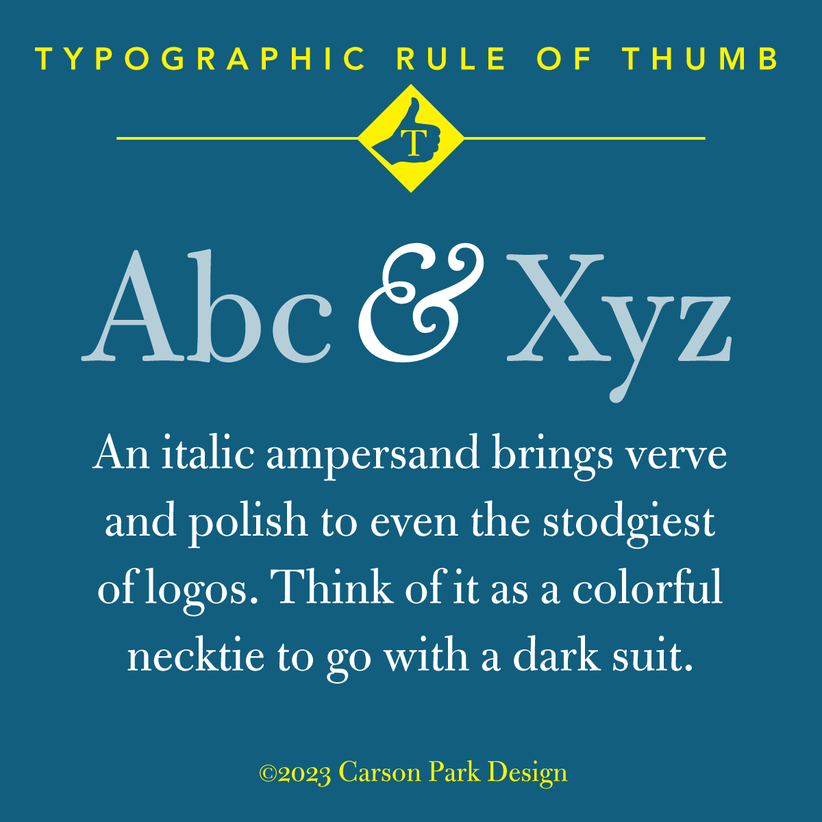
Bulmer MT Regular with a Goudy Oldstyle Italic ampersand
The italic versions of ampersands are typically less restrained than their roman counterparts. read more…
Cincinnati Type Foundry sale flyer

We recently purchased this 11 x 17″ sale flyer. read more…
The colorful etymology of the ‘giclée’ print
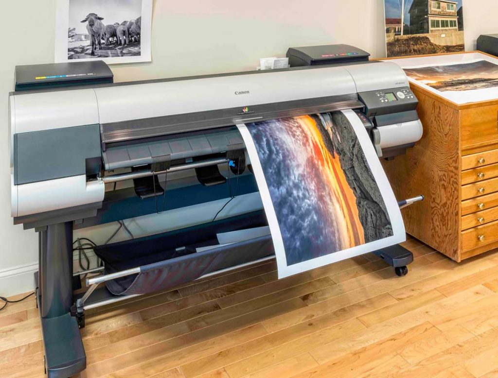
Q: What’s the difference between giclée and inkjet prints?
A: A couple hundred bucks.
In the world of limited edition art prints, giclée is a fancy word for inkjet art prints. read more…
