Extract vector logos from pdfs
![]()
Graphic artists often need high quality logos for projects. Go-to sites for corporate logos would be seeklogo.com and Brands of the World, but there’s a fallback method. read more…
Google Ads versus Facebook advertising
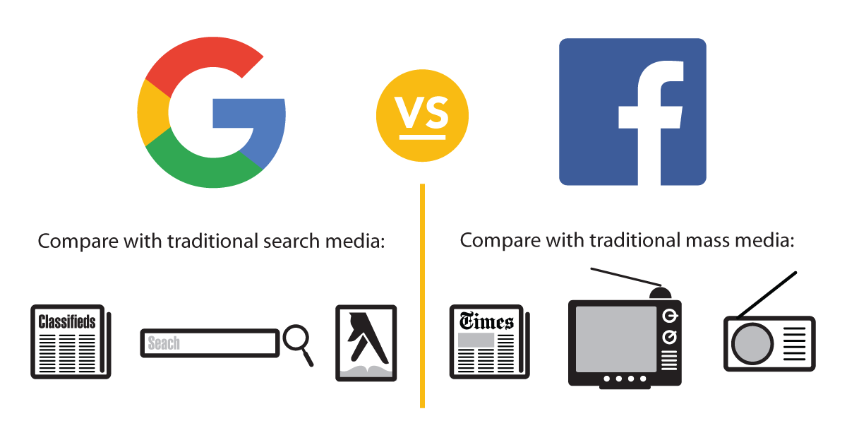
A thumbnail understanding of Google Ads and Facebook ads and promoted posts: read more…
The colorful etymology of the ‘giclée’ print
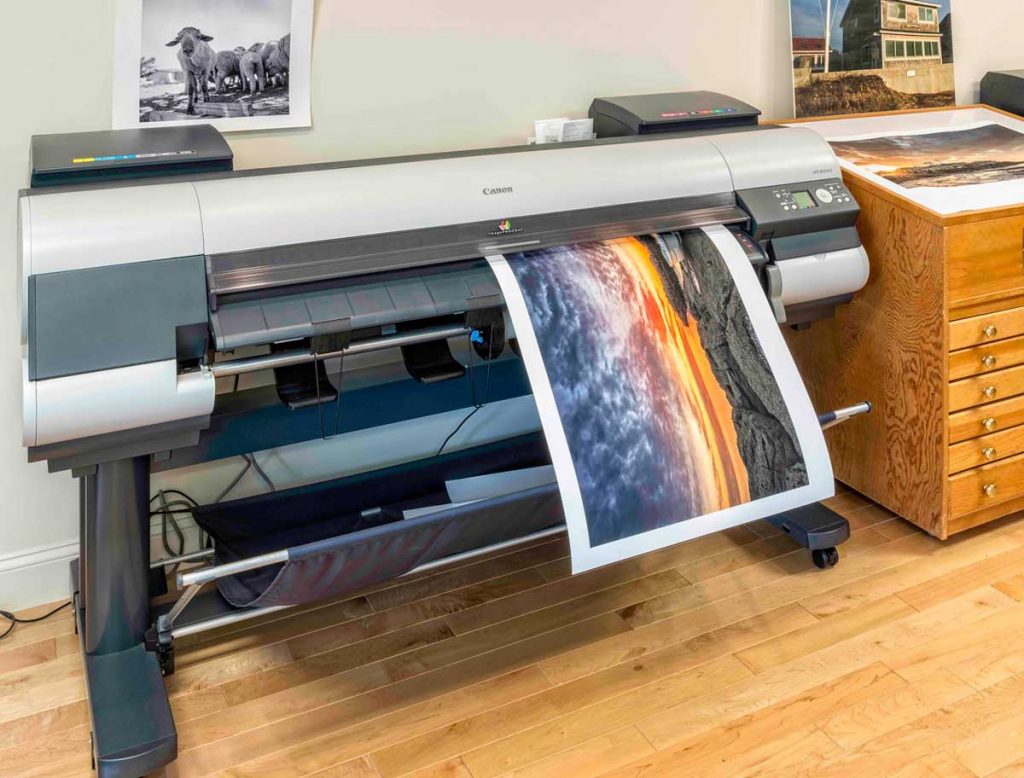
Q: What’s the difference between giclée and inkjet prints?
A: A couple hundred bucks.
In the world of limited edition art prints, giclée is a fancy word for inkjet art prints. read more…
Favicons: tiny branding

A favicon (or “favorite icon”) was the 16 pixel square image that precedes the website title in browser window tabs (see illustration). Favicons are now used for tile and touch icons, read more…
See-through perforated window signs
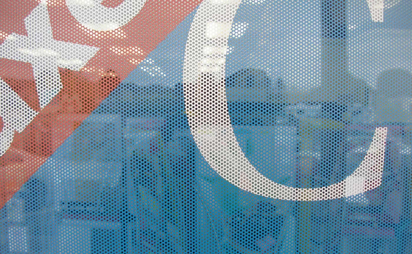
Turn windows into signage with see-through perforated window vinyl signs.
Perforated window vinyl has an image/graphic that is printed directly onto perforated, adhesive vinyl material, allowing people to see outside from within. The only thing visible from outside during daylight hours is your message.
This is made possible by puncturing 50% of the vinyl with holes holes small enough for the decal to maintain a high-quality image on one side yet be see-through on the other side.
One Way See-Thru Window Film:
• See out and let light in, while advertising to the outside
• Good for indoor and outdoor use
• Business/storefront advertising and product promotion
• Branding or decoration
• Diffuse sunlight, provide shade and privacy
The long s is often mistaken for an f

The long s (∫) has its roots in Roman cursive and was common in print in Europe from the 15th through the 18th centuries. It still appears in the German Eszett (ß), which is an sz ligature (a connected long s and short z). read more…
Optima’s monumental elegance

The names sandblasted into the dark granite of the Vietnam War Memorial were set in Hermann Zapf’s Optima. The elegant typeface is tightly leaded in all upper case to stunning effect. The dots that separate the names recall classical chiseled inscriptions. read more…
Always optimize images for your website

Image files should not go straight from camera to website
Large image files take up space and increase load time. Fast-loading websites require small image file sizes. read more…
The exclamation point —“a sign of failure”
The punctus exclamativus (or punctus admirativus) first appeared in the latter half of the 14th century to mark the end of an exclamation. The Italian poet Iacopo Alpoleio da Urbisaglia claimed to have invented it. The influential Italian humanist Coluccio Salutati revived the exclamativus and its use spread in the 15th century. read more…
Raster (or Bitmap) vs Vector images
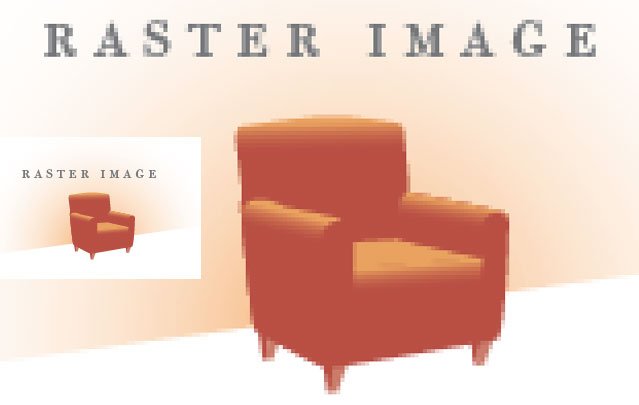
Raster (or bitmap) images are fixed-resolution, made of a grid of pixels. Enlarged they will be blurry and pixelated, with a jagged edge.
Common raster file formats are jpg, gif, tiff, bmp and png. read more…