Is yellow pages advertising still worth it?
If you’re still spending money in the various yellow pages, consider this: read more…
Formatting social media profile images
![]()
How do we turn this logo into a simple avatar? read more…
Virgule versus solidus
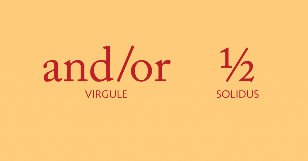
The slash on our keyboards is a virgule. The name comes down to us from Latin through French (virgula “twig”). It served medieval European literature as a comma and still does this in English language poetry. It also separates things (2015/2016), and it stands in for “or” (as in and/or) and “per” (as in feet/second). We also use it to build level fractions (1/3). read more…
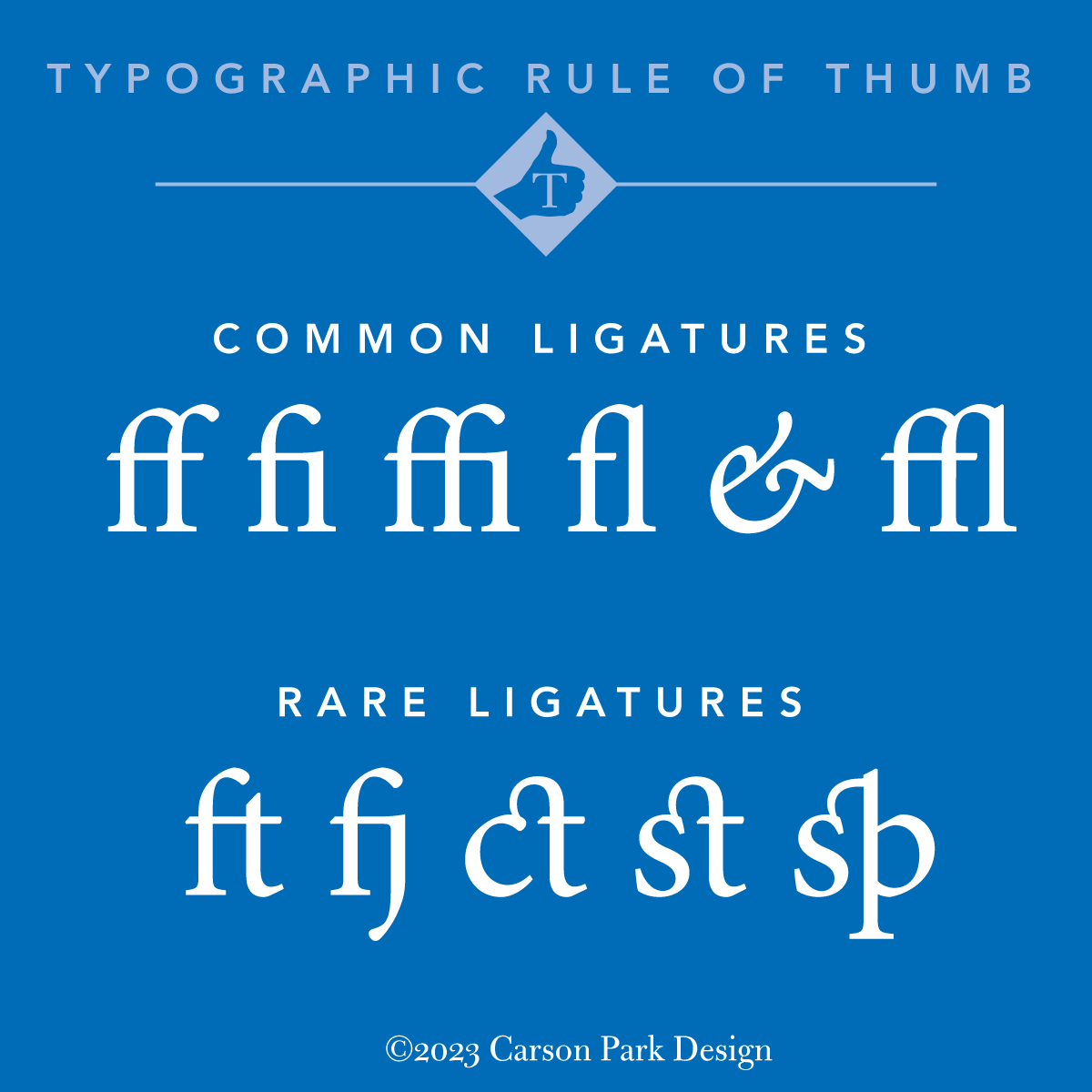
Ligatures: marriages of suitable characters
 Adobe Minion Pro offers a large selection of ligatures.
The ampersand is the best-known ligature but there are other commonly conjoined letters. Most Roman typefaces will include ff, fi, fl, ffl and ffi. read more…
Latin is all Greek to me
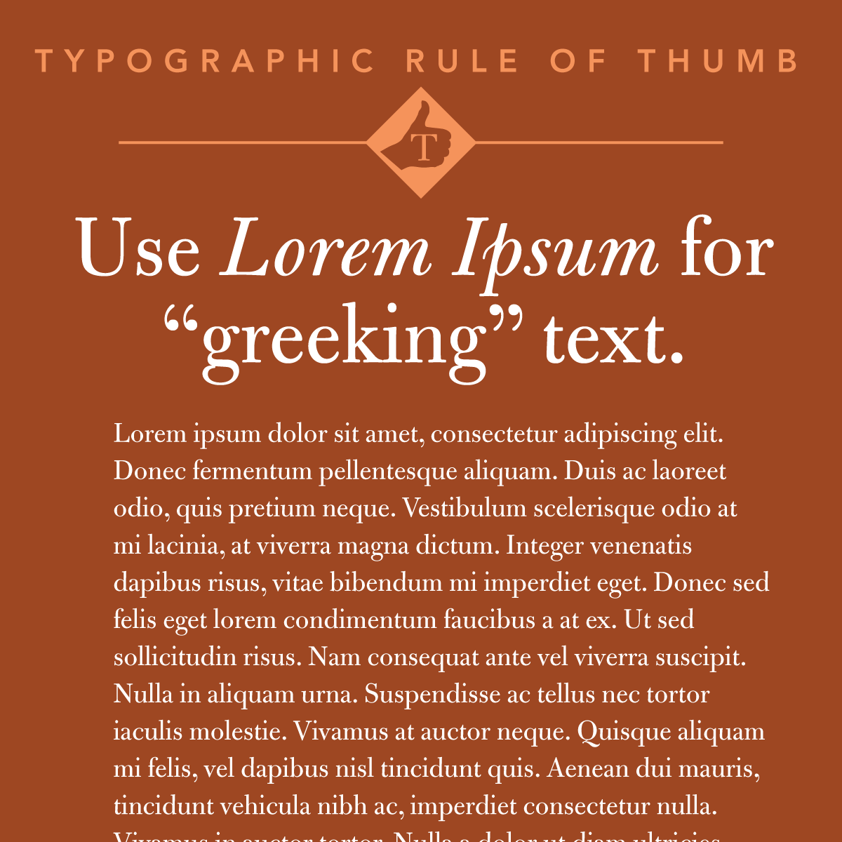
When designs are required before text is provided, greeking is a method of filling in where the text will go by sketching horizontal lines with a pencil, or, with the advent of design software, by dropping Latin dummy text into columns. read more…
Spot color trompe l’oeil…
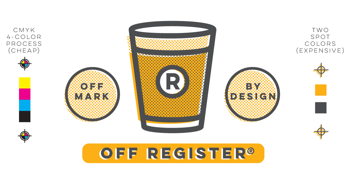
With the loss of so many letterpress and small offset job printing shops in the 1970s and the explosion of inexpensive process offset printing in the late ’90s, it is considerably more expensive now to print two colors than four colors. read more…
Tips on social media content
Here are a few rules of thumb for your business social media: read more…
At’s what we’re talking about
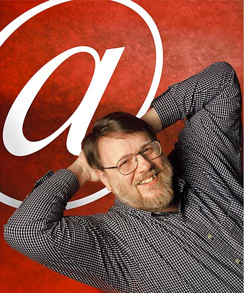 The at symbol’s roots are late medieval. Scribes perhaps created a shortcut ligature of the Latin ad (to or at).The first documented use was in a letter by Francesco Lapi in 1536. The Florentine merchant used @ to denote units of wine called amphorae (large clay jars). Business has long used it to signify “at the rate of,” and it was in such common use by the 19th century that it was included on typewriters as early as 1885. There was no place for @ in traditional typesetting, so there was no nook for the character in the California Job Case.
‘@’ has long been associated with retail sales and accountancy, but in 1971, Ray Tomlinson (23 April, 1941–5 March, 2016) was working on a way to communicate over a new computer network—the predecessor of the modern-day Internet. “I looked at the keyboard, and I thought: What can I choose here that won’t be confused with a username?” The at sign was an easy choice; it wasn’t commonly used in computing, so there would be no confusion. “It’s the only preposition on the keyboard.”
Is the question mark an abbreviation?

We’re not sure how the question mark in its present form came to be, but according to Alexander and Nicholas Humez, medieval scribes indicated a question by adding the interrogative quaestio at the end of what otherwise would have been a declarative sentence. read more…
Use italics for emphasis
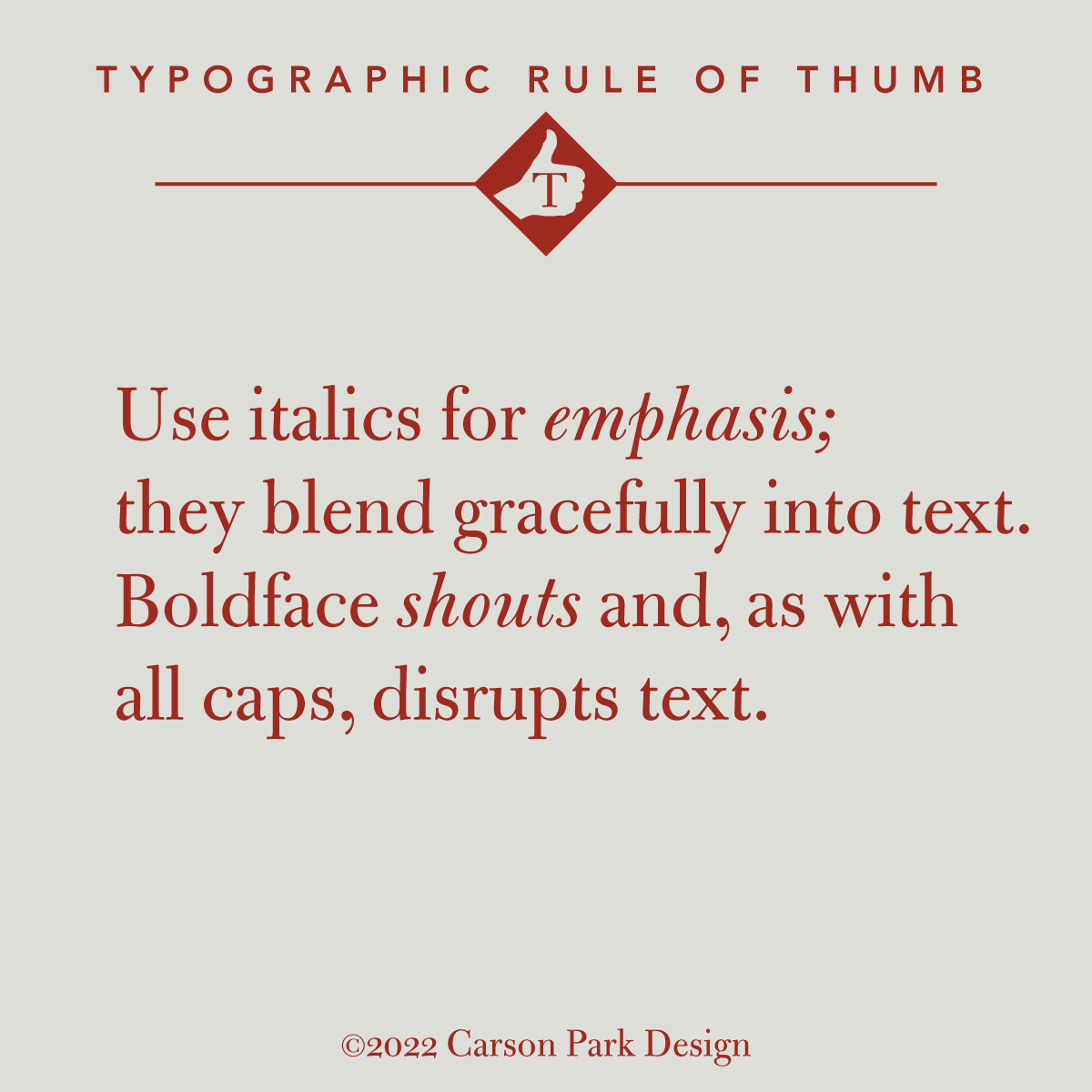
Italics are the elegant way to emphasize text. Bold faces are for headlines, posters or logos. Bold type breaks up the flow and degrades the readability of text just as words or phrases in all caps are like blotches in a column of type. Type often comes in extended families of varying weights, but as Robert Bringhurst said of boldface (which did not exist until the nineteenth century), “The marriage of type and text requires courtesy to the in-laws, but it does not mean that all of them ought to move in, nor even that all must come to visit.”
And cool it on the exclamations.