Ye olde deliberate antiquarianism…
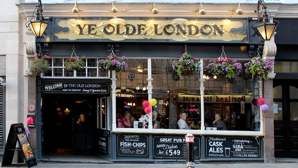
“Ye” was pronounced “the.”
“Ye” is a 16th century substitution of a ‘y’ for an Old English character known as the thorn (‘þ’), originally a Germanic rune that represented the interdental th sound. read more…
Don’t be out of sorts
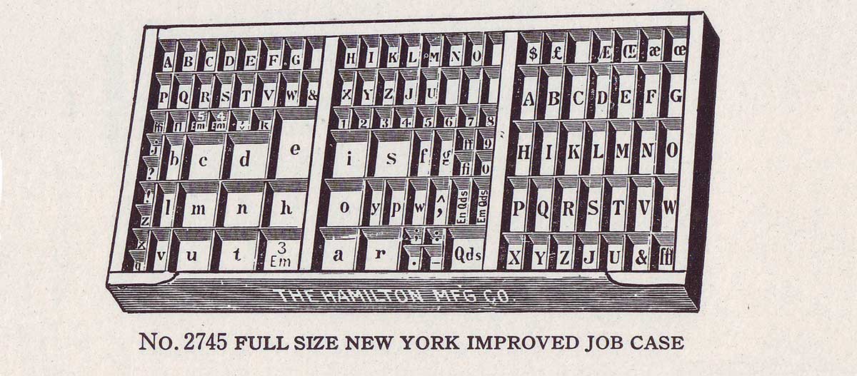
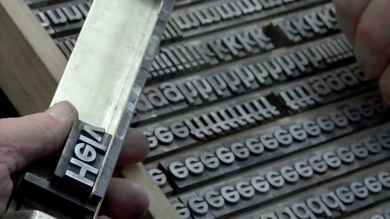
From the equipment section of the 1923 American Type Founders Specimen Book and Catalogue
To be “out of sorts” derives from printers’ jargon—meaning to run out of needed letters in a drawer or ‘case’ of metal foundry type. The term ‘upper and lower case’ derives from the drawers that type was stored in—caps in the upper case and minuscules in the lower case. read more…
Virgulilla: doubly diminutive
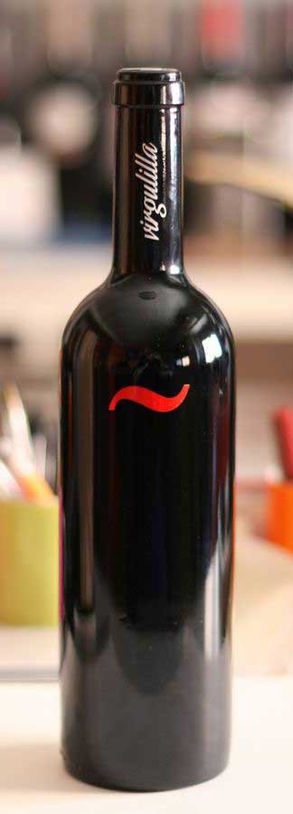 Virgulilla is Spanish for something like ‘an accent or mark.’ It refers to what in English we call the ‘tilde’ (which probably also derives from the Spanish*), but can also mean any diacritical mark resembling a comma, line or dash. The tilde originates from Latin as a “mark of suspension” in place of omitted letters in abbreviations (e.g., Anno Domini would be Aº Dñi). And, according to one source, medieval scribes abbreviated the phoneme “nn” as “n~” in order to distinguish it from “m.” Placing the mark above the n saved space (vellum was expensive). read more…
Indecorous display
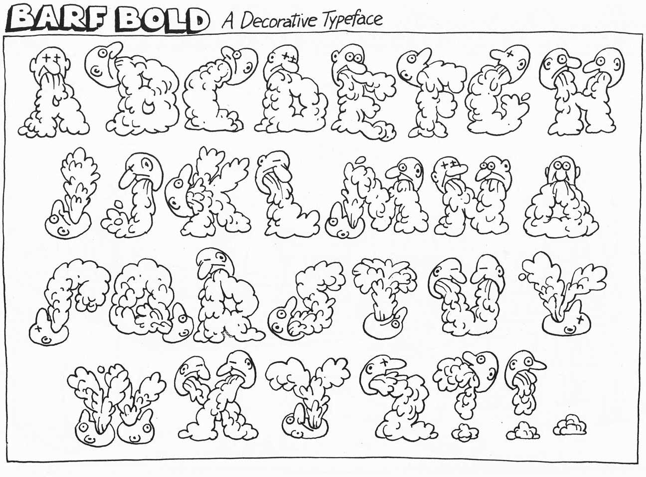 ©1982 B. Kliban — Notice that he didn’t use the current term “font”
Bernard “Hap” Kliban (1935–1990) offered Barf Bold, a Decorative Typeface in one of his hilarious cartoon collections in the early ’80s. Kliban created the cartoon genre that consisted of a single panel with a droll, third person narration (e.g., “Houdini escaping from New Jersey”), a style which Gary Larson of “The Far Side” later became famous for.
Kliban’s correct use of the term “decorative typeface” (he could have also used “display face”) is especially notable now that most people use the term “font” broadly to mean a printed face, a typographic family, a specific typeface, or (correctly) the licensed software that allows us to reproduce type on our computers.
What colors make white on the screen?
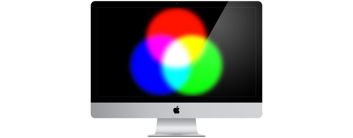
In print, white is a lack of color, the paper with no ink, but on a television or computer monitor, and in stage lighting, the opposite is true. Additive color on monitors is created by mixing red, green and blue light—referred to as RGB. Two additive primary colors produce a secondary color: red and blue make magenta, red and green make yellow, blue and green make cyan. Where all three overlap—voilà—white. Turn the colors off and you have black. The dark type you are reading here is where the red, green and blue screen pixels are turned down/off. The white background is the result of all three colors being on.
Deciphering Al Jazeera’s logo

Animation created by Jovan Cormac for Wikimedia Commons
Al Jazeera has one of the most recognizable logos in the world. The plucky network began broadcasting in 1996 and has survived US bombings of their bureaus in both Kabul and Baghdad. President George W. Bush even considered bombing Al Jazeera’s headquarters in Qatar, yet Al Jazeera has become a trusted provider of broadcast news worldwide. read more…
Epigram, epithet, epigraph, epitaph…
 The language quarterly Verbatim once published a mnemonic, in the form of a poem, to help us differentiate between these similar-sounding, but not-to-be-confused words.
Primer by David Galef, Oxford, Mississippi
The epigram’s a pithy saying, Full of paradox and wit.
The epithet’s a brief description. A clever name that scores a hit.
The epigraph’s a type of preface, Like the lead-in to a writ.
The epitaph is seen on tombstones, Related to who’s under it.
All four are commonly confused, But in each usage, three don’t fit.
‘Font’ versus ‘typeface’ (there’s a difference)
From the documentary “Helvetica,” by Gary Hustwit, ©2007 Swiss Dots Ltd.
Until the late mid 1980s, ‘font’ was a word that one never heard outside of the printing trades. When desktop computing made multiple typefaces available to the general public, ‘font’ entered the vernacular. It now refers to both the typeface—the design and appearance—and to the software file that generates it. read more…