1629: the year of the new letter U
The Latin alphabet had only 23 letters. J, U, and W were added in the middle ages and early modern era. read more…
Merry Xmas, Happy Holidays, &cetera
 ‘Xmas’ has been used in modern English since 1551, according to the Oxford English Dictionary. The X is an abbreviation from the first letter of Greek Christos. First appearing in English in the Anglo Saxon Chronicle in the early twelfth century, it was spelled with Xp or Xr, corresponding to the Greek ‘Chr,’ thus Xres mæsse meant ‘Christmas.’ read more…
Cincinnati Type Foundry sale flyer
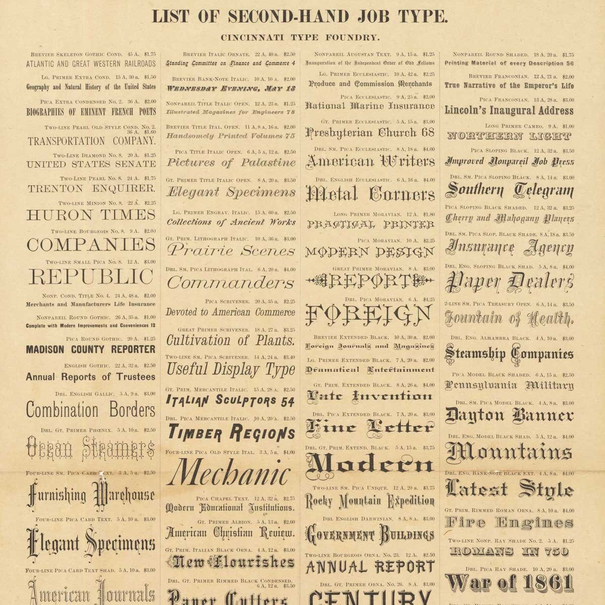
We purchased this 11 x 17″ sale flyer in 2018. read more…
St. Patrick’s leprechaun, shamrock, green beer typeface

Every year we trundle out the “Gaelic fonts,” for St. Patrick’s Day. Uncials are popularly associated with the Book of Kells and all things Celtic. Insular (Irish) scripts descended indirectly from Byzantine Greek scripts which inspired a Latin version in the west based on Roman cursive. The ascenders and descenders in uncials were forerunners to lower case. read more…
American Type Founders Specimen Book…
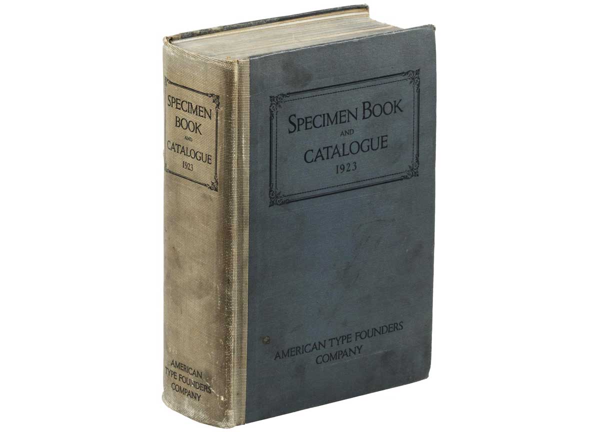
American Type Founders was born of a merger of 23 type foundries in 1892. In the early 1920s, American Type Founders had come to dominate the huge metal foundry type market in the United States. They budgeted a whopping $300,000 (millions in today’s dollars) to produce 60,00 copies of their 1923 Specimen Book. read more…
Type Anatomy
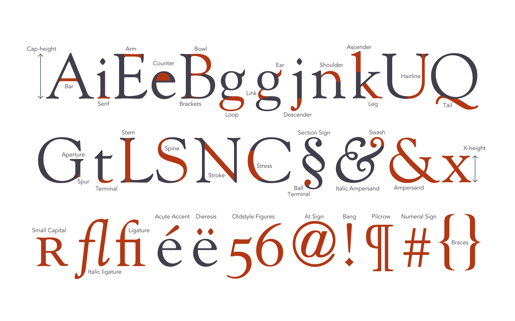
Our type anatomy chart, which was inspired by a similar diagram in U&lc magazine in the early 1980s. Access a high resolution pdf here. Besides typographic parts, we’ve included some diacritical marks, punctuation and common sorts.
Lovely, short letterpress documentary
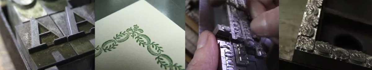
“If I were to be sat down at a computer and told, ‘here, you can do whatever you want,’ I wouldn’t know what to do. There would be too many choices,” says John Kristensen, of Firefly Press in this gorgeous short film. Take a moment to enjoy the rich artistry and craftsmanship in the everyday work of the Firelfy Press in Sommerville Massachusetts.
Hand-lettered Lombardic caps in early print
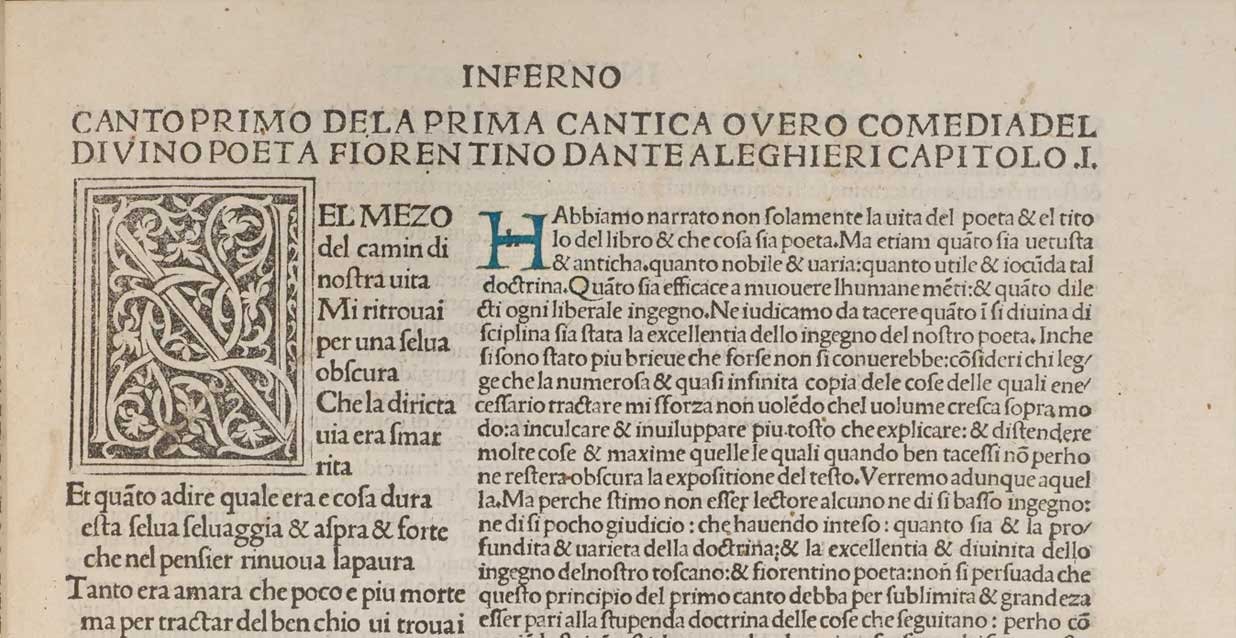
Here’s an illustration of how early printers marked the space for hand-lettered versals (‘drop caps,’ or enlarged initial letters). read more…
Forms of indulgence (and the first fonts)
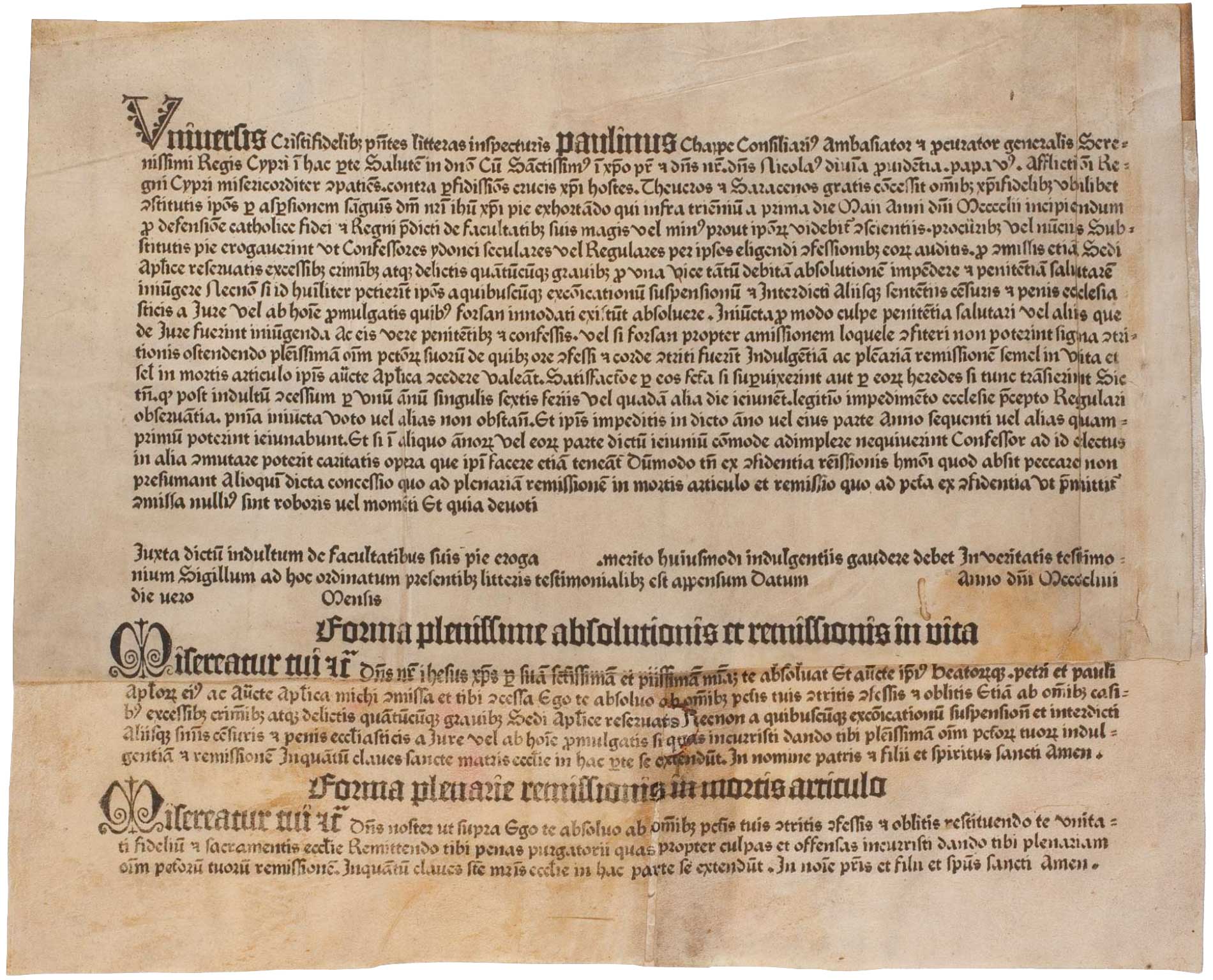
Indulgence form printed by Guttenberg (Herzog August Bibliothek, Wolfenbüttel)
“Since the eleventh century, indulgences and pardons had been awarded by the Church for the remission of sins, earned either by prayer or through donations. An indulgence took the form of a preset document with a space left for the name of a penitent as proof of his or her right to divine forgiveness. For the Church, this involved costly, labour-intensive procedures where thousands of identical documents would be written by hand.”
—Paul McNeil, The Visual History of Type read more…
Quotation marks & apostrophes versus primes
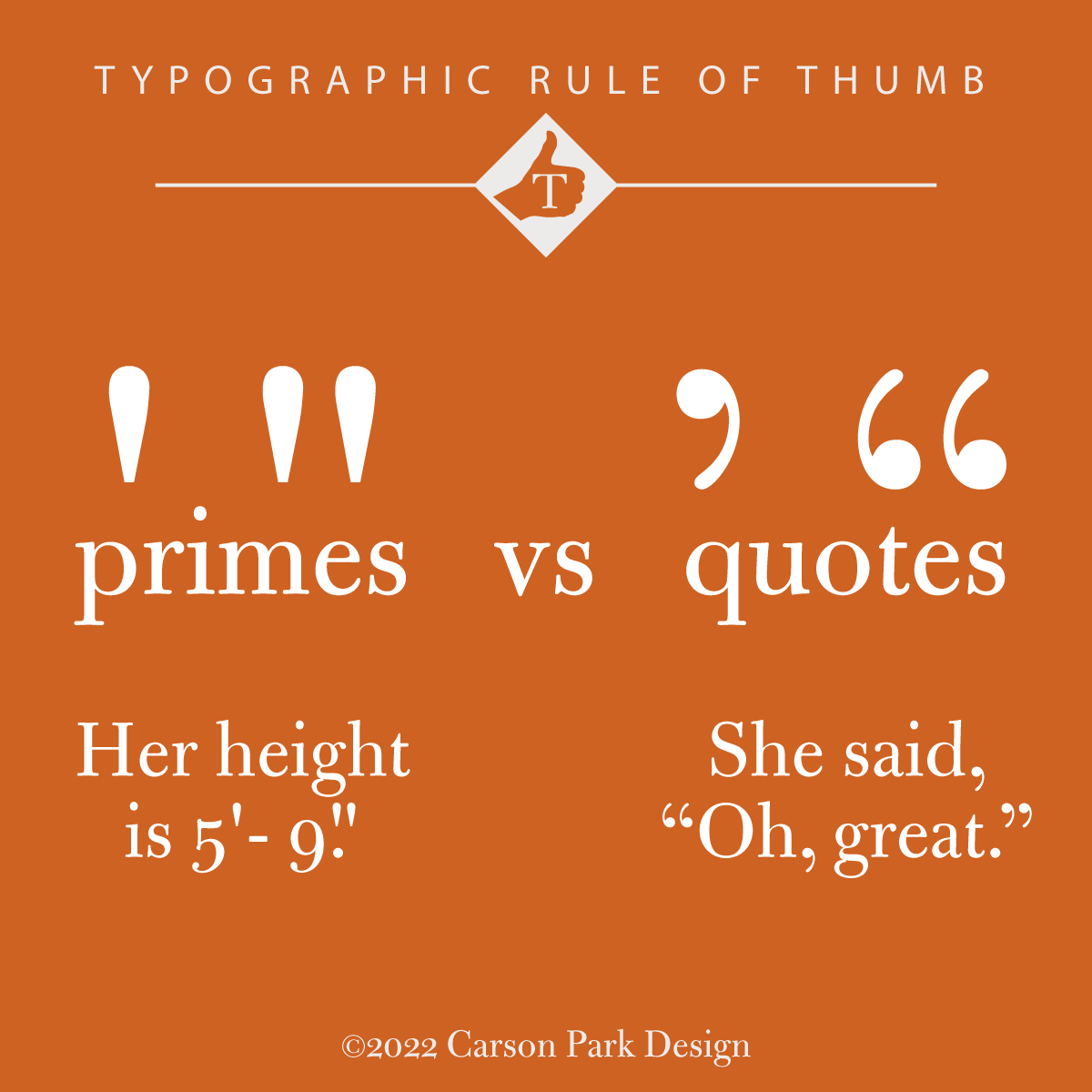
Single primes are used to mark feet, and double primes for inches. They are no substitute for apostrophes and quotation marks—a mistake made even in (shudder) company logos. read more…